Diablo Tools
Summer 2026 Internship in User Experience Design and User Research. The following is a case study for a Link-in-Bio page redesign that I created for Diablo Tools’ Social Media team. Please view my resume for details on other projects (mobile app design, user surveys, landing pages, user personas, etc.).
Date
May-July 2026
Tools
Figma, FigJam, HubSpot
HotJar, Google Analytics, Excel, Google Gemini, Miro
Designing a Clearer Path to Product
Problem
During my time at Diablo Tools, I designed four landing pages and contributed to projects spanning user research, mobile app design, and digital experiences. For this project, the Social Media team needed a new way to showcase their content and encourage users to engage with their social links landing page.
The previous page lacked clear visual hierarchy, felt visually overwhelming, and reflected an older version of the Diablo Tools brand that relied heavily on red. Working alongside the Social Media team, I set out to create a cleaner, more engaging experience that made it easier for users to find and interact with relevant content.
Background
Below is a snapshot and video of Diablo Tools’ previous Link-in-Bio page, which served as the primary destination linked across the brand’s social media accounts. Visually, the page lacked a clear focal point, making it difficult for users to understand where their attention should be directed. The absence of a strong visual hierarchy, combined with the heavy use of the brand’s accent red, created a cluttered and overwhelming viewing experience.
Using Hotjar, I also observed a relatively low click rate on the page, suggesting that users may not have been effectively guided toward key content. The social media team wanted to create a cleaner, more intuitive experience that aligned with industry standards and made it easier for users to navigate and engage with Diablo Tools’ content.
Diablo Tools Social Links Page (Before)
Diablo Tools Social Links User Perspective Video
O1 Research
Before beginning the initial wireframes, I led ideation meetings with the Social Media team to understand what they wanted the experience to accomplish. Rather than jumping straight into visual design, I used these conversations to define the purpose of the page and establish a clear user journey.
I asked questions such as “What is the purpose of this site?”, “What do we want users to do?”, and “What words should describe this experience?”. These discussions helped uncover the team’s priorities, identify the most important content, and narrow down the intended path from social media to the website.
01.1 Leading Ideation Meetings
User Journey Map Presented to Social Media Team in First Meeting
I analyzed the social links pages of five competitive brands, including Bosch and Home Depot, to understand industry conventions and user expectations.
A consistent pattern emerged: three-panel rows were used to organize content into a familiar, scannable layout. This insight directly influenced my initial wireframes, helping me create a structure that felt intuitive while still being tailored to Diablo Tools.
01.2 Competitive Analysis

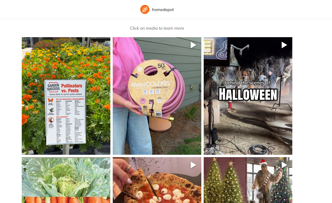
Bosch USA’s and Home Depot’s Social Links Pages
02 Ideate
Wireframes, Figma, and Prototyping
The initial designs incorporated the social media team’s key requests: highlighting the top four seasonal products and creating dedicated pages with product-specific banners and content.
My design priorities included:
Clear visual hierarchy to guide users toward key content and calls to action
More intentional use of red to create emphasis without overwhelming the page
A three-panel layout that provided a clean, industry-standard structure while giving each piece of content a clear place
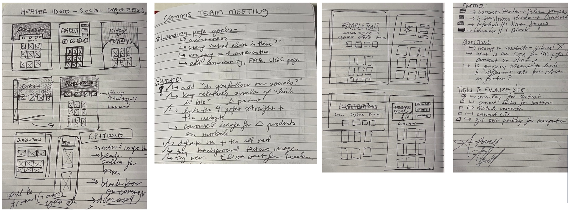
I began with quick paper wireframes to explore different layouts and page structures before moving into Figma, where I applied the Diablo Tools brand palette and began refining the designs.
Paper Wireframes and Meeting Notes
Version 1.0 Figma Wireframes
Version 1.0 Prototype Video
Design Iterations
During the design process, I questioned the value of creating dedicated banner pages for the top four products when those pages already existed elsewhere on the Diablo Tools website. Adding another step to the user journey provided little additional value, so I proposed removing the pages and directing users to the relevant product information instead.
After collaborating with the social media team, we aligned on a simplified user journey that supported both user needs and the team’s goals. With this updated direction, I created 13 design variations and presented them to the social media team for feedback.
What changed with each iteration, and why?
Banner headline variations to determine the most attention-grabbing approach.
To solve the unclear hierarchy problem mentioned earlier, I designed each iteration to explore how to best establish a clear focal point and guide users into the page.
Background options to create stronger visual contrast and emphasis
Image sizing and placement to improve visual balance and hierarchy
Mobile layouts to ensure the experience translated effectively across devices
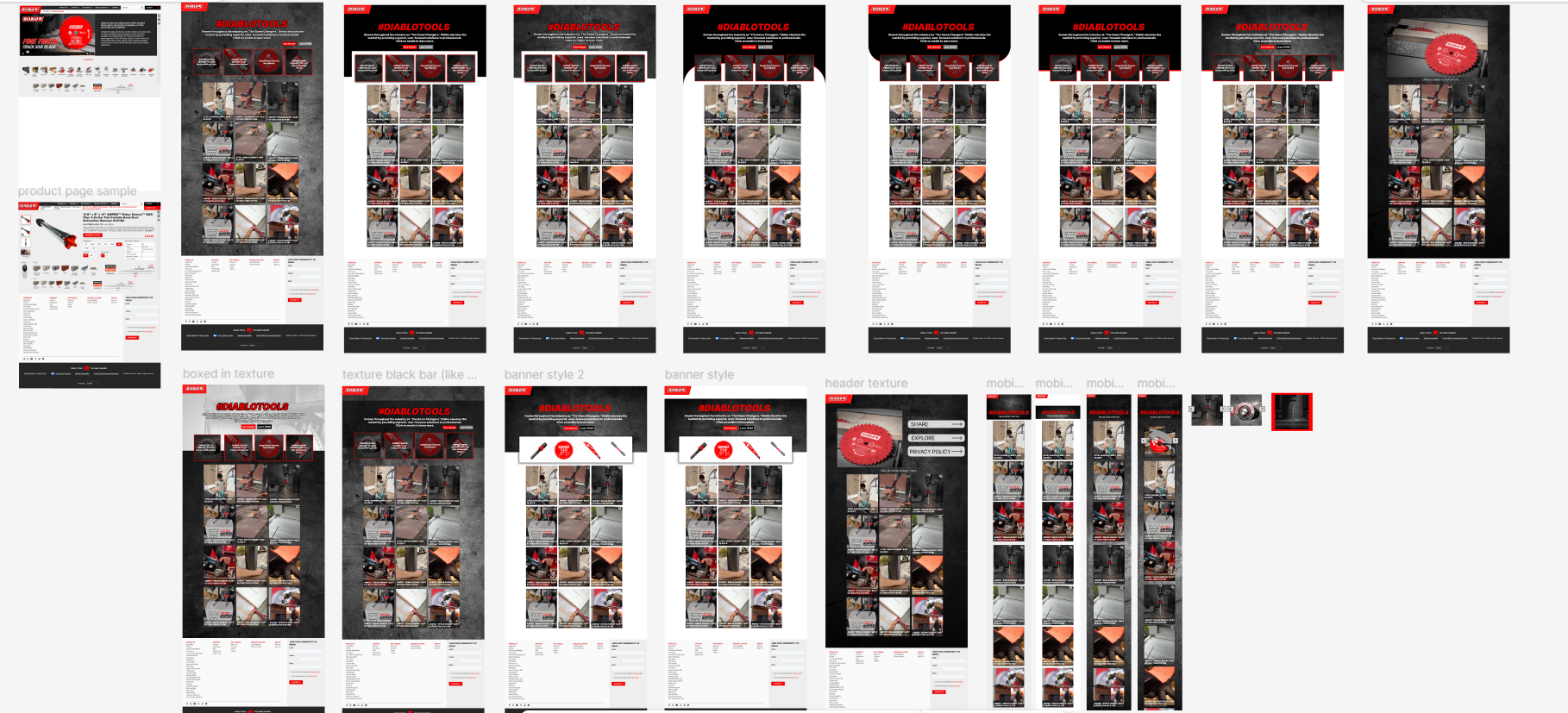
Design Iterations Wireframes and Video Prototypes
03 Functional Prototyping
Moving the Designs to the Site
Once the designs were refined, I brought them into HubSpot using its website-building tools to translate my concepts into functional pages. Building the designs in the platform allowed me to evaluate each option in a more realistic context and understand how users would experience the different layouts.
I created 10 variations that explored consistent rectangular layouts alongside different backgrounds and visual treatments. After several follow-up conversations with the social media team, we narrowed the options down to our top four before selecting a final design that best balanced the team’s goals with a clear and engaging user experience.
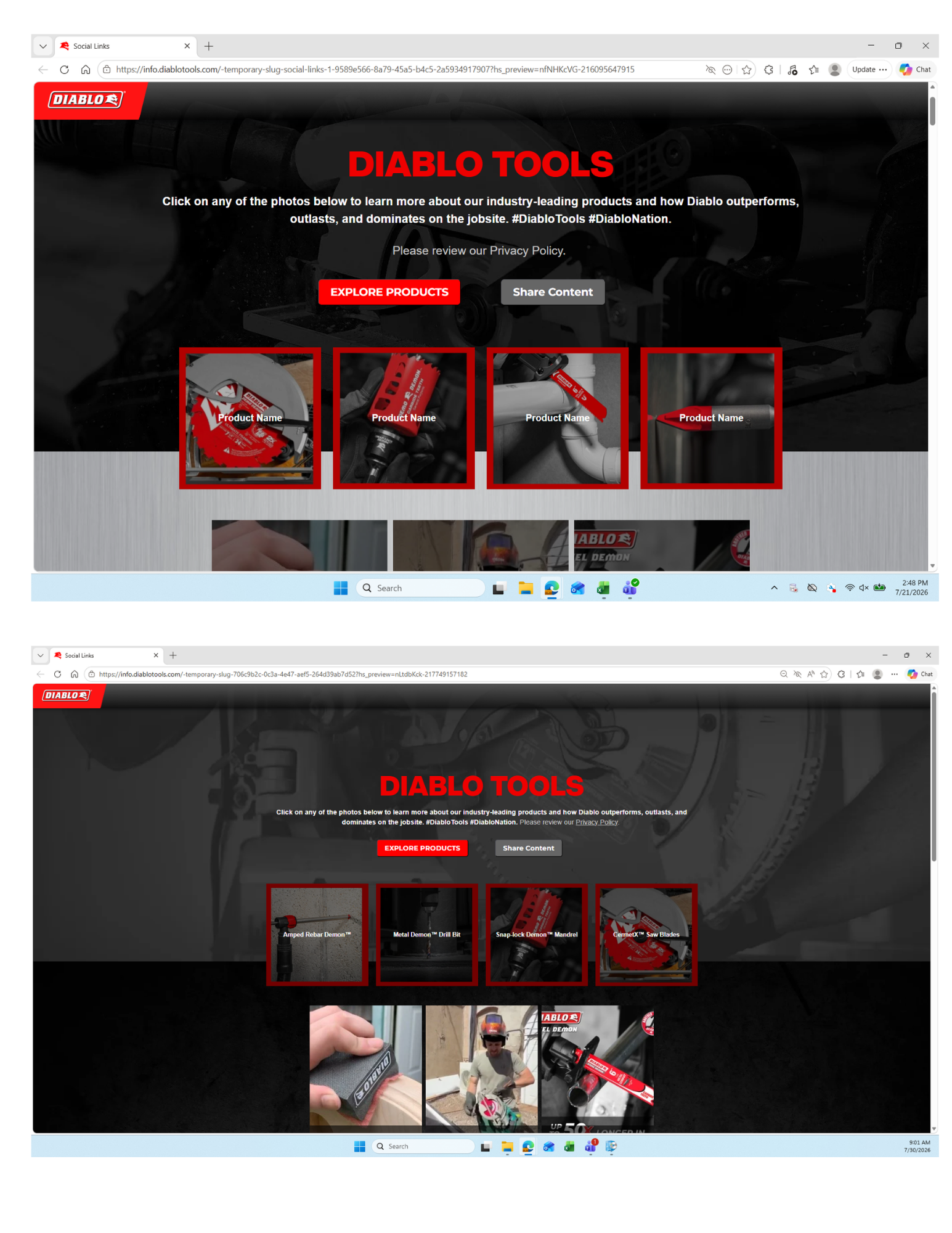
The Top Four Selected Designs
04 Final Product
Due to the timeline of my internship, the development team continued making updates to the site after my project concluded. The final design is currently housed within Diablo Tools’ systems and is planned for a future launch. Once live, user engagement data can provide valuable insight into how users interact with the new experience and inform future iterations of the Social Links page.
The Finished Site and Next Steps
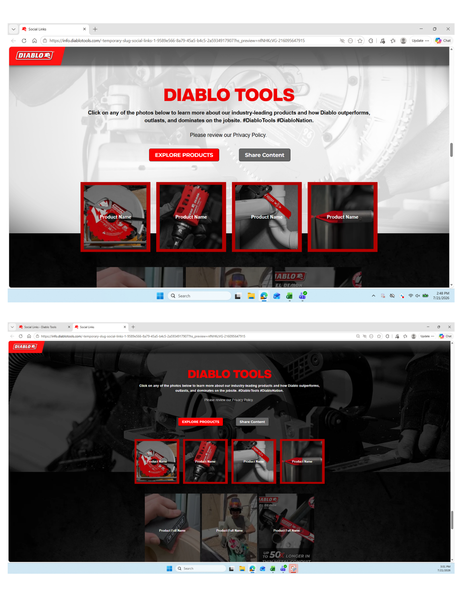
The final Link-in-Bio experience brings together the social media team’s goals with a more intentional, user-centered design. The key features of the final site include:
Interactive hover states that highlight featured products and make their purpose immediately clear
Direct product links that reduce friction and connect users to relevant pages on the Diablo Tools website
A three-panel layout that creates a clean, familiar structure and improves content hierarchy
The result is a cleaner, more engaging experience that gives users a clearer path from social media to the products and content they’re looking for.
Next Project…